|
Pens and Brushes
|   |
|
Pens and Brushes
| |
Most objects use a pen and a brush. The pen is the outline of the object and the brush is the fill. These tools make each object especially customizable. To edit the brush and pen of the object, click on the object in the Dashboard Object View window. The Dashboard Object Properties window will show a list of everything you can customize about that object. Towards the bottom of the window you will find the Pen section followed by the Brush section.
Pen
To open the Pen section, click the + to the left of the title. A menu will appear if it is not open already, giving you the following options:
|
PROPERTY REFERENCE |
|
|
Width |
This is the width of the pen in relation to the percentage of the window. (For example, the default width is 0.5, which is 0.5% of the screen size. To make the pen thicker, increase the width.) |
|
Dash Sizes |
When the dash and gap sizes are set to 0, the pen will be a solid outline. To make the line dashed, set the size here. The higher the number, the longer the dash will be. Multiple dashes can be used here. Just separate each value with a comma. |
|
Gap Sizes |
In order for a line to be dashed, the gap size must be greater than 0. Enter in the size of the gap you desire in between each dash. *You can also make a width list on the dashes and gap sizes. To make it work, there must be the same of dash size values as gap size values. For example, if you want to have a dash pattern of short, longer, longest, and keep your gap sizes the same, you could enter the values 1,5,10 in your dash size list and 1,1,1 in your gap size list. |
|
Color |
You can select the color of the pen by either entering the RGB color coordinates on this line or selecting the box at the right of this line. (Click on the line and the box will appear.) |
|
Opacity |
255 is the default setting, which is completely opaque. To make it 50% translucent, set it to about half of 255, or 128. |
|
Cap |
This is the setting you adjust for the finishing endpoints of the dashes. There are three styles you can select from: round, square, and butt. The round and square add length onto the dashes, whereas the butt keeps the dash length the same. |
|
Style |
To make the pen transparent, select it here. This should be preferred over setting the pen width to zero, since it will turn the pen off completely, which will speed up the rendering. |
Brush
To open the Brush section, click the + to the left of the title. A menu will appear if it is not open already, giving you the following options:
|
PROPERTY REFERENCE |
|||||||||
|
Color |
You can select the color of the brush by either entering the RGB color coordinates on this line or selecting the box at the right of this line. (Click on the line and the box will appear.) |
||||||||
|
Opacity |
255 is the default setting, which is completely opaque. To make it 50% translucent, set it to half of 255, or 128. |
||||||||
|
Style |
Here is where you select which fill you will use.
|
||||||||
|
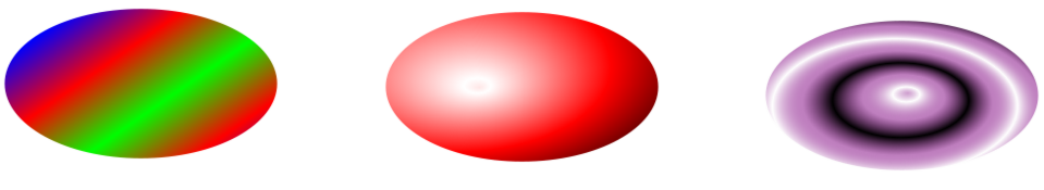
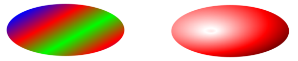
Gradient Style |
You can select the style to be linear or radial. Here are examples of the two styles, respectively:
|
||||||||
|
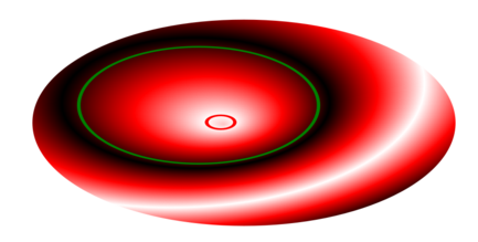
Gradient Point 1 |
If the selected gradient style is radial: As a radial gradient is a value scale that goes from one circle to another, this is the center point for your first circle, at which point the gradient will start. Here is an example of a radial gradient. The first circle is outlined in red. The second circle is outlined in green.
Gradient point 1 is the center point of the first circle. If the selected gradient style is linear: This is the starting point for your gradient, where your offset value will start (see color stops for more information on the offset). |
||||||||
|
Gradient Point 2 |
If the selected gradient style is radial: This is the center point for your second circle (see gradient point 1 for an explanation). If the selected gradient style is linear: This is the ending point for your gradient, where your offset value will end (see color stops for more information on the offset). |
||||||||
|
Gradient Radius 1 |
This value is used for the radial gradient only. This represents the radius of the first circle (see illustration above). |
||||||||
|
Gradient Radius 2 |
This value is used for the radial gradient only. This represents the radius of the second circle (see illustration above). |
||||||||
|
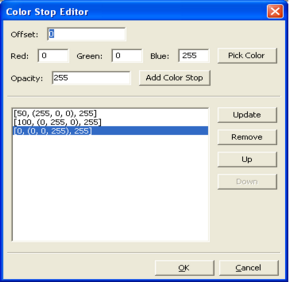
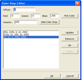
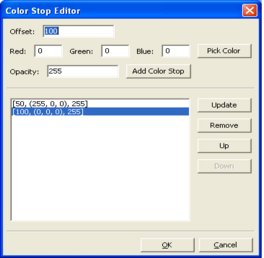
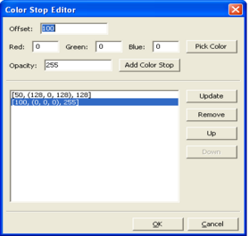
Gradient Color Stops |
Editing a gradient's color stops allows you to change the colors of the gradient and transparency of each color, as well as where in the gradient the color will change. To edit a gradient's color stops, click in the box, then click the
Here are some examples of gradients with their corresponding color stop lists:
|
||||||||
|
Hatch Style |
There are several different styles to choose from in this drop-down menu. |
||||||||
|
Hatch Color |
Select the hatch color here. |
||||||||
|
Hatch Opacity |
Set the opacity to the hatch fill here. 255 is completely opaque, 128 is half translucent, and 0 is completely translucent. |
||||||||
|
Hatch Scale |
The larger the number here, the larger the hatch. |
||||||||
|
Image Pattern |
Select the image you want to tile as your fill. If you are pulling an image off of the internet, save it to your computer first. Then click inside this box and the |
||||||||
|
Image Opacity |
On a scale of 0 to 255, 0 being completely translucent and 255 being completely opaque, you can set the opacity of the image fill here. |
||||||||
|
Image Scale |
You can make the image tile larger or smaller by adjusting this value. |
||||||||
|
Image Rotation |
Set the angle of rotation, if any, you would like the fill to tile on. Click here for more information on angles and degrees. |
||||||||
Click an object below to learn about its other characteristics, or click here to go to the Dashboard Object Property Reference page.